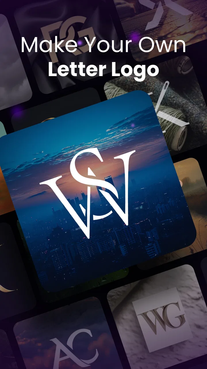
Arvin® - AI Logo Maker
- 4.8
- Rating
- 5.00M
- Installs
- Free
- Price

 Analysis by App-foxy
When I need a logo quickly, I am usually not looking for a full branding studio. I want a clear mark that can work on a profile image, a small business page, a presentation, or a social post without spending an entire evening learning design software. That is the space where Arvin® - AI Logo Maker makes sense. It is a free art and design app from IdeaLabs, built around the idea of helping people create a logo on a phone rather than starting with a blank canvas.
My first impression is that it is aimed at speed and accessibility more than deep professional control. That is not a criticism by itself. A beginner, a student, a new seller, or someone testing a business idea may benefit more from a guided logo creator than from a complicated desktop editor. The important question is whether that convenience is enough for your particular project, and whether you are comfortable making the final design decisions yourself instead of accepting the first attractive result.
How I would decide whether Arvin is the right logo tool
I would judge this app using four practical questions. First, how quickly can I move from an idea to a usable visual identity? Second, can I make the result feel specific to my project rather than like a generic template? Third, will the design remain readable at the small sizes where logos are often used? Finally, does the free starting point offer enough value before in-app purchases become relevant?
You May Also Like

 Blood Strike: 2.5 Anniversary
Blood Strike’s Loadouts Turn Every Drop Into a Tactical Gamble
A close look at Blood Strike’s custom loadouts: how fast access to signature weapons reshapes its battle royale rhythm, rewards preparation, and narrows the gap between fights.

 Pandora - Music & Podcasts
Pandora’s Music Is Easy to Start, but Harder to Recover
Pandora’s strength is its low-effort path from a seed to a station. Its weak spot is how much confidence it asks you to place in connection, setup, and quiet recovery.

 8 Ball Pool
 Is Built on Rivalries, Rematches, and Routine
A close look at the rivalries, rematches, shared routines, and unanswered safety questions that turn a quick pool match into a persistent mobile community.

 Samsung Music
’s Quiet Strength Is Playing What You Already Own
Its reach comes less from spectacle than from dependable access to a personal library. That simplicity is both the app’s strongest retention engine and its ceiling.

 AccuWeather: Weather Radar
AccuWeather Review: A Quick, Clear Forecast for Everyday Decisions
For everyday plans, the best forecast is the one you can understand quickly. AccuWeather makes rain timing, radar, and local conditions easy to act on, with a few trade-offs.

 Hill Climb Racing
Why Hill Climb Racing Still Turns Crashes Into One More Run
A tiny car, a bumpy hill and one more upgrade: Hill Climb Racing keeps resurfacing because its simple chaos makes every near-miss feel personal.
More From Our News Desk



Those questions matter because a logo maker can look impressive while producing designs that fail in everyday use. A detailed emblem may look good on a large phone screen but become muddy as a profile picture. A stylish type treatment may be difficult to read when printed or placed over a busy background. I found it more useful to treat the app as a rapid idea generator and editing workspace, not as a replacement for a brand strategist or a full vector design program.
The app is available at no upfront cost, and its content rating is Teen. It supports Android 7.0 and later, which makes it accessible on many older devices as well as newer phones. The current version is 2.4.3. That combination is helpful for users who do not own a recent flagship phone, although the experience can still depend on screen size, device performance, and how comfortable you are editing on a touchscreen.
Its public reception also suggests that it has reached a substantial audience: the app has an average rating of 4.6 from around 76 thousand ratings, with more than a million installs. I would not treat those figures as proof that every logo will be excellent, but they do indicate that the basic concept is working for many people. The developer, IdeaLabs, has positioned the product for a broad audience rather than only trained designers.
Start with the use case, not the template
Before opening the editor, I recommend writing down where the logo will appear first. If the immediate need is a small avatar for a handmade-goods account, simplicity matters more than decorative detail. If the logo is for a local service, legible lettering and a recognizable symbol may matter most. If it is for a gaming group or a creative project, a more expressive style may be appropriate, but it still needs a version that works without losing its shape.
This small preparation step prevents one of the most common mistakes in logo apps: choosing a design because it looks exciting in the editor, then discovering that it does not communicate anything at the size people will actually see. I would create a short list of two or three words describing the intended personality, such as calm, handmade, technical, playful, or premium. Those words give me a better filter than browsing attractive graphics without a clear direction.
What I look for while editing
In a phone-based workflow, I pay attention to how easy it is to compare variations. I want to test a darker and lighter background, a shorter name treatment, and a version with less visual clutter. I also check whether the central symbol remains recognizable when I mentally shrink it to a small circle. This is where a logo creator earns its place: not by producing one attractive image, but by helping me explore several sensible directions quickly.
One useful habit is to separate the logo into three decisions: the symbol, the lettering, and the surrounding space. Even if the app presents these choices through a more guided interface, thinking about them separately helps me avoid overloading the design. A symbol that already carries the message may need very little decoration. Likewise, a distinctive name may work better with restrained graphics than with multiple icons competing for attention.
I also recommend making a deliberately plain version before experimenting with effects. A clean baseline makes it easier to see whether later changes improve the identity or merely make the preview more dramatic. This is a non-obvious advantage of working in a logo app: quick experimentation is valuable, but only if I keep one simple reference version for comparison.
Where Arvin wins for fast, phone-first design
The strongest case for this app is convenience. I can approach a logo without knowing how to build shapes from scratch, manage a complex layer system, or understand every principle of professional identity design. That lowers the barrier for people who need a usable starting point today. A small business owner preparing a social page, for example, can develop a visual direction while sitting in a café rather than waiting to access a computer.
I especially see value for people who are still testing an idea. Suppose I am considering a weekend baking service and want to create a temporary identity before investing in packaging or signage. I can use the app to compare a word-focused logo with a simple food-related mark, then see which direction feels closer to the service. The goal at this stage is not to lock in a perfect lifelong brand. It is to make the idea visible and learn what feels right.
Another strength is the low-risk entry point. Because the app is free to start, I can explore its approach before deciding whether it deserves a place in my regular workflow. In-app purchases range from $0.99 to $99.99 per item, so I would look carefully at what is available at no cost and avoid assuming that every desirable option is included. The broad price range makes it especially important to understand the value of any purchase before confirming it.
For a beginner, the guided nature can also be more encouraging than a blank design canvas. A blank canvas gives maximum freedom, but it can make the first decision feel impossible. A logo maker gives me something to react to. I can say, “This is too busy,” “The lettering feels too formal,” or “The symbol is closer, but the spacing is wrong.” That kind of comparison is often easier than inventing a complete identity from nothing.
A practical workflow for a new project
Here is how I would use it for a small online shop. I would begin by creating a version that uses the shop name clearly, then make a second version where the symbol carries more of the identity. I would compare both at a small size, because the shop may use the mark as a social avatar or a tiny account image. Next, I would remove any element that does not help recognition and keep the most readable arrangement as the primary candidate.
After that, I would place the candidate beside the shop name in a mock social profile and imagine it on a simple product label. This is more revealing than judging the logo against the editor’s interface. A design that looks balanced in isolation may feel crowded next to real text. A logo that seems minimal may become exactly right when surrounded by product information.
The final step would be to save the design direction in a small personal reference note: the chosen colors, the preferred arrangement, and the version intended for small spaces. Even if the app helps create the artwork, consistency still depends on the user. This workflow turns a quick logo experiment into something more useful for future posts and documents.
Three details that improve the result
My first tip is to design for recognition before personality. Personality can come from color, type, or a distinctive shape, but recognition depends on a clear silhouette and readable wording. If I have to explain what the symbol represents every time someone sees it, I should simplify it or reconsider whether it adds value.
My second tip is to create a compact version early rather than treating it as an afterthought. Many people design a wide logo and only later discover that it does not fit a square avatar. I would test a compact arrangement during the first session. If the name is long, I would consider whether the symbol can work alone in small contexts while the full version appears on larger surfaces.
My third tip is to compare designs in neutral conditions. Bright editor backgrounds and decorative previews can make almost any logo feel more polished. I prefer to view candidates against a plain light background and a plain dark background, then reduce the visual size. This exposes weak contrast, thin details, and lettering that depends too heavily on the surrounding preview.
Where a different kind of design app may fit better
Arvin is not the best choice for every project. If I need precise vector construction, exact brand color management, detailed path editing, or a carefully documented identity system, I would choose a more advanced design application. A professional designer may also prefer a desktop tool because a mouse, keyboard, and larger canvas make alignment and refinement more efficient.
The same applies when a logo must be prepared for many physical uses. A mark for packaging, signage, embroidery, and print materials may require technical control that a fast mobile creator is not designed to provide. In that situation, I could still use Arvin for early concepts, but I would expect to rebuild or refine the chosen idea elsewhere before production.
Template-driven tools are another alternative category. They can be better when I need a coordinated set of social graphics, flyers, and presentation elements rather than one logo. A dedicated vector editor is better when originality and editability are the priority. A professional identity service is better when I need research, naming advice, audience positioning, and a brand system rather than a quick visual.
There is also a personal trade-off. Guided creation saves time, but it can encourage similar-looking results if I accept the first appealing combination. The app can help me move faster, yet speed makes it easier to stop before asking whether the design is distinctive. I would therefore treat its suggestions as starting points, not as finished brand thinking.
Who should skip it
I would skip this app if I already have a detailed brand brief and need exact control over every curve, spacing value, and output requirement. I would also look elsewhere if I need a complete identity package with carefully matched typography, stationery, packaging, and usage rules. Those needs go beyond the quick logo-making workflow that makes this app attractive.
I would be cautious if I dislike making design judgments. A logo creator can offer a starting point, but it cannot decide whether the result truly represents a business. Someone who wants a completely automatic answer may be disappointed by the need to compare, simplify, and test the designs. The app reduces technical friction; it does not remove the need for taste and practical review.
Finally, users with strict spending limits should examine the purchase prompts carefully. The free entry is useful, but the presence of individual purchases from $0.99 up to $99.99 means I would not begin a project assuming every asset or option is included. I would first establish whether the free workflow can produce something acceptable, then decide whether a paid item solves a real problem rather than merely adding decoration.
What switching away would cost in time and effort
The cost of starting with Arvin is low because I can explore a concept on a mobile device without committing to a complex setup. The cost of switching later depends on how seriously I use the result. If the logo is only for a temporary social page, replacing it may be simple. If I have already printed labels, built profile graphics, and used the mark across several channels, changing direction becomes more disruptive.
That is why I would keep the original concept process organized. I would save the strongest variations, note which one is intended for small spaces, and avoid spreading an untested logo everywhere immediately. This gives me a short evaluation period. I can see whether people recognize it, whether it remains readable, and whether it feels appropriate beside the actual content of the business.
Switching to a more advanced tool later may also involve recreating the design rather than opening it as a fully editable professional file. For a casual project, that may be acceptable. For a serious brand, I would plan for a refinement stage from the beginning. In other words, Arvin can be a useful first studio, but I would not automatically treat the first export as the permanent master artwork.
For collaboration, I would also establish one person as the final decision-maker. Mobile logo apps make it easy for several people to suggest changes, but too many opinions can produce a crowded compromise. I prefer to collect feedback on clarity and suitability, then let one person choose the direction. That keeps the app’s speed from turning into endless variation.
My recommendation for different kinds of users
I recommend Arvin to beginners who need a logo quickly, small projects testing their identity, students creating a visual mark for a club or presentation, and creators who want to explore several directions from a phone. Its free starting point, accessible Android support, and guided approach make it a sensible first step when the alternative is doing nothing or becoming overwhelmed by professional software.
I would recommend it with more caution to an established business. It can still be useful for brainstorming or refreshing an idea, but I would test the result in real contexts before adopting it everywhere. Check the logo at small size, on light and dark backgrounds, beside ordinary text, and in a simple mockup of the place where customers will see it.
My overall view is positive, but deliberately limited: Arvin® - AI Logo Maker is strongest as a fast concept-to-logo tool, not as a complete branding department. It helps turn a vague idea into something visible and gives non-designers a practical place to begin. Its value comes from reducing the first hurdle, while the quality of the final result still depends on the choices I make after the first attractive preview.
If I were recommending it to a friend, I would say: install it when you need a logo direction now, start with a clear use case, make a simple version before adding effects, and test the design where it will actually appear. If the project later demands precise production files or a full identity system, move to a more specialized option. Used with that expectation, this app is a convenient and approachable way to get from an empty idea to a workable visual starting point.
FAQs for Arvin® - AI Logo Maker
01What is Arvin® - AI Logo Maker and how does it work?
Arvin® - AI Logo Maker is an innovative app that uses artificial intelligence to help users create professional logos effortlessly. By inputting your brand's name and preferences, the app generates multiple logo designs to choose from. It employs advanced algorithms to ensure that each design is unique and tailored to your specifications, making branding accessible and hassle-free.
02Is Arvin® - AI Logo Maker suitable for beginners?
Absolutely! Arvin® - AI Logo Maker is designed with an intuitive interface that caters to users of all experience levels. Whether you're a seasoned designer or a complete novice, the app provides easy-to-follow instructions and a user-friendly experience, allowing anyone to create high-quality logos without needing extensive design knowledge.
03What features does Arvin® - AI Logo Maker offer?
The app offers a wide array of features, including customizable templates, a vast library of fonts and icons, and color palette options. Users can tweak elements like size, color, and layout to suit their brand’s identity. Additionally, the app supports high-resolution exports, ensuring your logo looks sharp on digital and print media.
04Are there any costs associated with using Arvin® - AI Logo Maker?
Arvin® - AI Logo Maker offers both free and premium versions. The free version provides access to basic features and a limited selection of templates. For a more comprehensive experience, including access to exclusive designs and advanced customization tools, users can opt for the premium version, which requires a subscription.
05Is my data safe with Arvin® - AI Logo Maker?
Yes, your data is protected with Arvin® - AI Logo Maker. The app employs robust security measures to ensure that your personal information and design projects are kept confidential. Additionally, the app complies with industry-standard privacy regulations, providing users with peace of mind while using the platform.
Pros
- User-friendly interface simplifies design.
- Wide range of templates available.
- Quick export options for various formats.
- Customizable elements for unique designs.
- Regular updates with new features.
Cons
- Limited free version features.
- Occasional app crashes reported.
- Some designs require in-app purchases.
- Ads can be intrusive at times.
- Not all fonts support special characters.

Arvin® - AI Logo Maker
Gallery